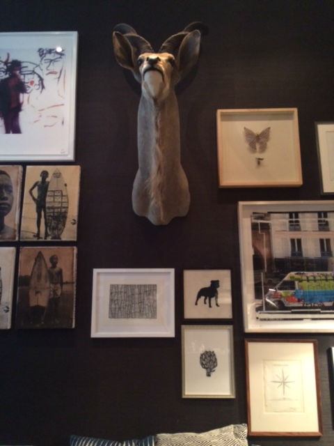
Although the gallery wall trend has been around for a long time, we’re still amazed by how different each finished wall can look, and all of the creative interpretations that can be had. One recent example of this was a recent gallery wall installation done at a client’s home in New York City. It had all of the components that make a gallery wall interesting, fresh, and one-of-a-kind.

1. Depth. The variation in the frame depth — from shadow boxes, to poster-style frames — ensures a dynamic display.
2. Texture. Like mixing up the frames, this wall creates visual interest be incorporating different textures: from the glossy posters, to the crosshatch-style sketch, and the natural elements added by the deer head.
3. Mixed Media. Again, variety is the key to this look. The wall incorporated framed insects, photos, drawings, antlers, etc.
4. Color. There should always be one constant among the pieces in your gallery wall. Here, it’s the color–everything is neutral and muted–that ensures a cohesive look.