September marks the start of what we call “color season.” From early fall through the end of the year, the color authorities that be begin to release their colors of the year, or the hues they believe will be the hottest for the upcoming year. Among the first to announce their top pick is paint manufacturer Sherwin Williams. This year, they announced Poised Taupe as their top pick. It’s a pale, earthy, mink-like shade of taupe that Sherwin Williams deems “classic” and “modern” at once. While the pick may seem safe (not unlike Benjamin Moore’s designated hue last year, Simple White), it’s actually a bit of a departure from recent neutral paint trends, which have largely revolved around cool-toned gray. It’s a change we’re happy to see, after years spent hanging art on walls painted in variations of colors like”charcoal,” “smoke,” “cloud,” and “silver.” While taupe can still read gray in certain light, it’s definitely a warmed-up take that’s heading back in a brown, earth-tone direction.
Being that it’s a neutral shade, Poised Taupe will go with many styles and colors of wall art, but not everything. According to Sherwin Williams, cornflower hues, nature-inspired palettes, vintage-y pastels, shades of wine red, and contrasting brights like yellow are the most complementary.
We perused Pinterest for the best examples of wall art done right on Poised Taupe walls (or at least shades that are similar), and here’s what we found.
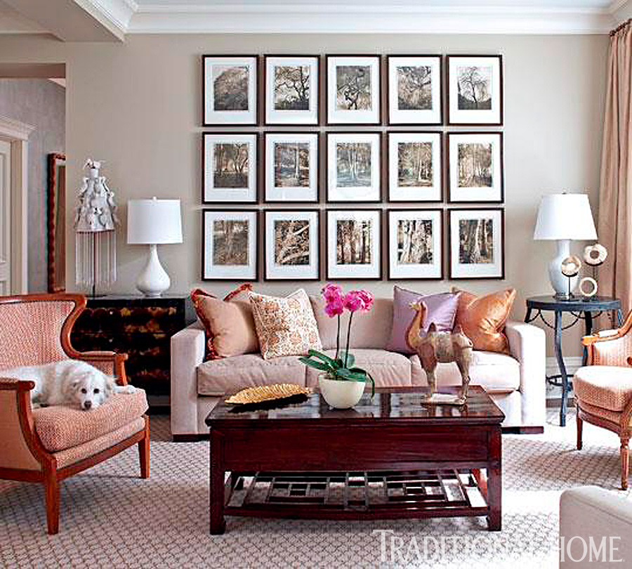
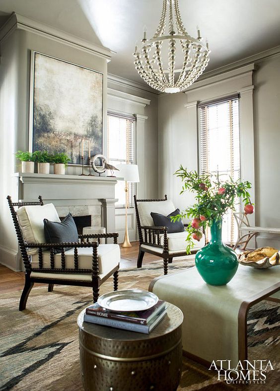
Keeping the wall art neutral, but high-contrast creates a bold but polished look in this living room.
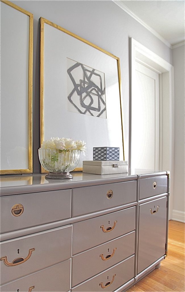
We love how the gold warms up the color.
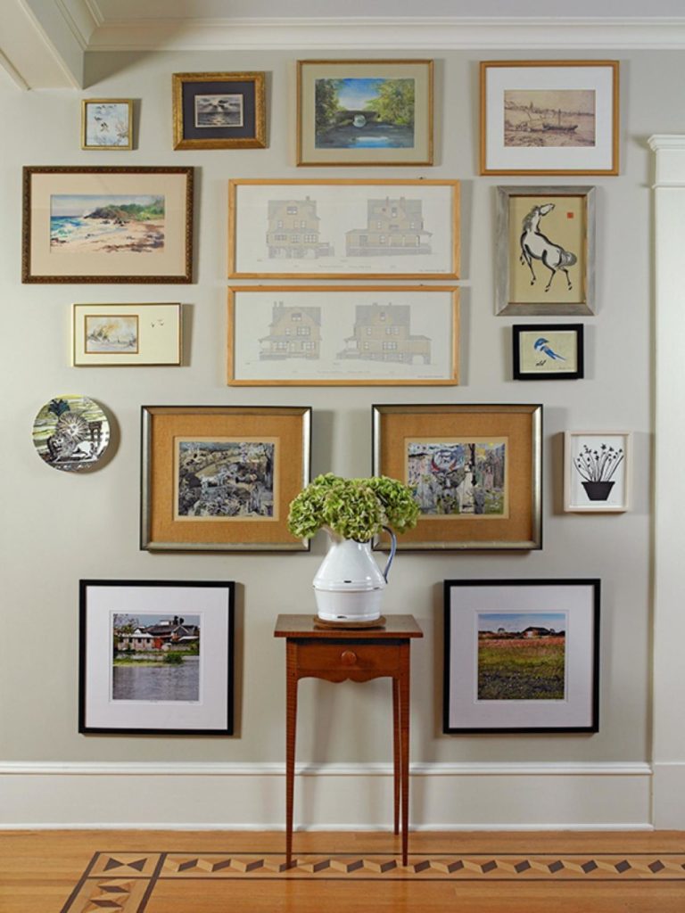
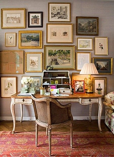
Poised Taupe makes a lovely backdrop for a collection of vintage-style art and prints.

Here, a bright shade of blue is a beautiful complement.
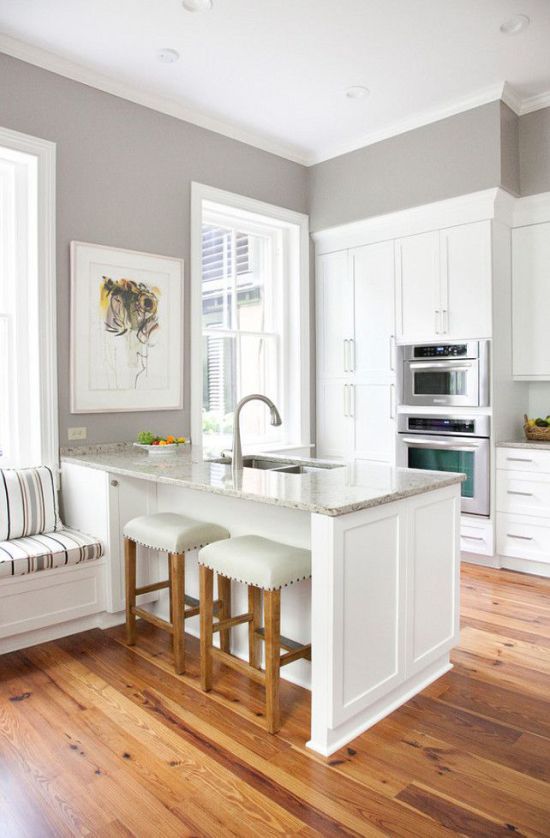
How lovely does a greige shade look against bright white? The yellow in the abstract painting below adds just the right amount of color.
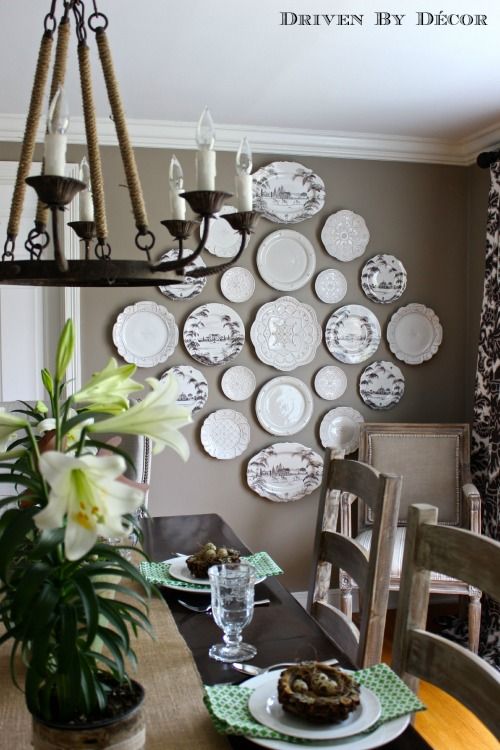
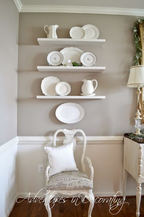
Another example of a neutral palette, this time made with antique plates.
We love the variations of beige, brown and white found in the beautiful impressionist style painting hanging over this mantle.
A gorgeous collection of artwork in muted hues feels like a natural choice.
And finally, a simple white arrangement has French-county appeal.
Which is your favorite version of the look?